You are not logged in.
- Topics: Active | Unanswered
#1 2020-10-23 00:24:30
- golinux
- Administrator

- Registered: 2016-11-25
- Posts: 3,608
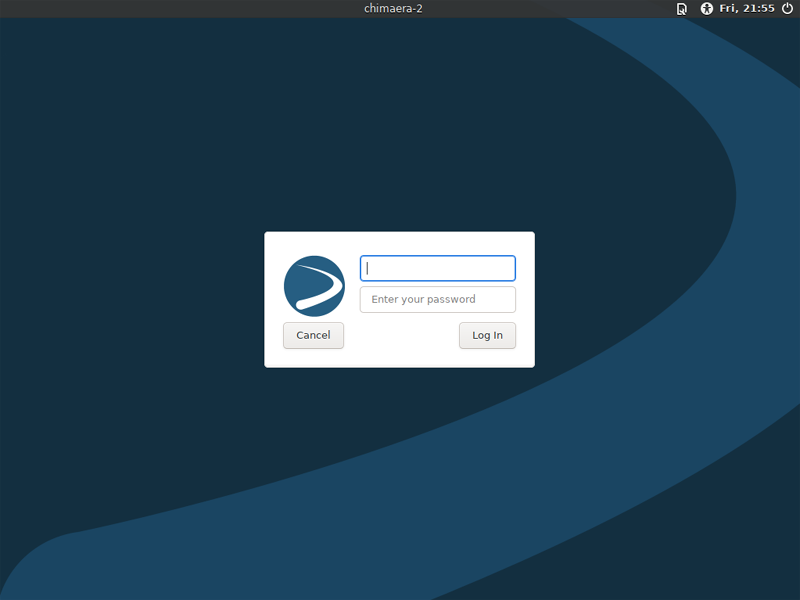
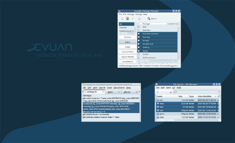
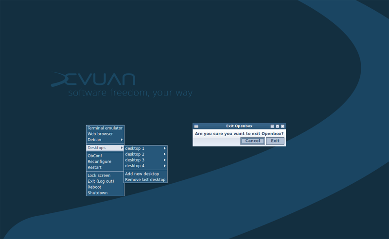
Meet Chimaera's deepsea theme


![]()
Finally, have the Chimaera deepsea theme together. Am now getting all the other parts in place. Enjoy your dive to the deepsea floor!
Offline
#2 2020-10-23 01:11:02
- sgage
- Member
- Registered: 2016-12-01
- Posts: 342
Re: Meet Chimaera's deepsea theme
I like it!
Offline
#3 2020-10-23 01:57:22
- zapper
- Member

- Registered: 2017-05-29
- Posts: 1,197
Re: Meet Chimaera's deepsea theme
This wallpaper is okay, but I liked the brown one more. A light gray one would also be good in future someday though!
Freedom is never more than one generation away from extinction. Feelings are not facts
If you wish to be humbled, try to exalt yourself long term If you wish to be exalted, try to humble yourself long term
Favourite operating systems: Hyperbola Devuan OpenBSD Gnuinos
Peace Be With us All!
Offline
#4 2020-10-23 02:08:57
- golinux
- Administrator

- Registered: 2016-11-25
- Posts: 3,608
Re: Meet Chimaera's deepsea theme
There has never been a brown theme. That was Ubuntu.
I think you would understand the Chimaera colors if you have this bit of info - my inspiration.
This is the last time I am putting myself through this ordeal. Someone else is going to have to step up to do the next ones.
Offline
#5 2020-10-23 02:11:09
- zapper
- Member

- Registered: 2017-05-29
- Posts: 1,197
Re: Meet Chimaera's deepsea theme
There has never been a brown theme. That was Ubuntu.
Hmm, maybe its more of a dark redish brown i was thinking of.
Lol...
I got my colors mixed up probably.
Freedom is never more than one generation away from extinction. Feelings are not facts
If you wish to be humbled, try to exalt yourself long term If you wish to be exalted, try to humble yourself long term
Favourite operating systems: Hyperbola Devuan OpenBSD Gnuinos
Peace Be With us All!
Offline
#6 2020-10-23 02:15:36
- golinux
- Administrator

- Registered: 2016-11-25
- Posts: 3,608
Re: Meet Chimaera's deepsea theme
I used cinnabar colors for Beowulf. That crimson pigment (which is quite toxic) was very popular in the Renaissance.
Offline
#7 2020-10-23 07:39:07
- blackhole
- Member
- Registered: 2020-03-16
- Posts: 167
Re: Meet Chimaera's deepsea theme
You can't please all of the people all of the time...
I remember when Debian Squeeze released with the "space fun" theme. It was hated by most, but it actually grew on me eventually. There's no accounting for taste. Ubuntu were a success with their brown themes and then their purple ones, despite all the critique. When all is said and done it's just a default and the user will change it to suit, minutes after installation.
Offline
#8 2020-10-23 13:06:47
Re: Meet Chimaera's deepsea theme
@golinux FWIW here are a couple of sites that help with color palettes....
Pax vobiscum,
Mark Rabideau - ManyRoads
i3wm, bspwm, dkwm, dwm, hlwm, sway, openbox on Sid/ ceres ~ Linux #449130
"For every complex problem there is an answer that is clear, simple, and wrong." -- H. L. Mencken
Offline
#9 2020-10-23 14:49:08
- golinux
- Administrator

- Registered: 2016-11-25
- Posts: 3,608
Re: Meet Chimaera's deepsea theme
@golinux FWIW here are a couple of sites that help with color palettes....
You've got to be kidding. I have never found a generated color palette that didn't suck. Why? Because choosing colors by some mathematical formula just doesn't work in the real world. Why? Because colors are relative to the other colors that are proximate and only the human eye can see that.
That's Western reductionist thinking on steroids - thinking not actually seeing.
Offline
#10 2020-10-23 14:52:37
- PedroReina
- Member

- From: Madrid, Spain
- Registered: 2019-01-13
- Posts: 295
- Website
Re: Meet Chimaera's deepsea theme
Screenshot of an early mockup of the Chimaera desktop.
This is a very personal taste and a lot of people here are going to customize their environment. But we need a default. This one proposed pleased me very (VERY!) much.
Offline
#11 2020-10-23 15:07:19
- nixer
- Member

- From: North Carolina, USA
- Registered: 2016-11-30
- Posts: 231
Re: Meet Chimaera's deepsea theme
It's done folks and not going to change (much).
Why change, I like it! Really it is only a start, and will be changed very soon after installing - just like blackhole said.
Because colors are relative to the other colors that are proximate and only the human eye can see that.
So true! I once made a website for a horse, a very expensive horse. I had the hardest time choosing a color scheme to use, so I used the horse itself for my color selection. From a nice photo of the horse, I lifted a light and dark color for my color scheme. It worked quite well.
Don't be surprised if this thread gets deleted.
I for one appreciated the introduction to the new theme colors, and its inspiration. Thank you.
Offline
#12 2020-10-23 15:20:12
- golinux
- Administrator

- Registered: 2016-11-25
- Posts: 3,608
Re: Meet Chimaera's deepsea theme
It's done folks and not going to change (much).
Why change, I like it! Really it is only a start, and will be changed very soon after installing - just like blackhole said.
It's more than the desktop. It is grub and slim/lightdm and website(s) and installer banner and icons yada, yada. There will be no escaping it. ![]()
Offline
#13 2020-10-23 15:25:39
- Head_on_a_Stick
- Member

- From: London
- Registered: 2019-03-24
- Posts: 3,125
- Website
Re: Meet Chimaera's deepsea theme
Brianna Ghey — Rest In Power
Offline
#14 2020-10-23 15:36:11
- golinux
- Administrator

- Registered: 2016-11-25
- Posts: 3,608
Re: Meet Chimaera's deepsea theme
golinux wrote:Lol.
The deep sea Chimaera is a magnificent beast!
Offline
#15 2020-10-23 16:25:21
- golinux
- Administrator

- Registered: 2016-11-25
- Posts: 3,608
Re: Meet Chimaera's deepsea theme
@nixer . . . I'd love to see that horse site. Care to share a link?
Offline
#16 2020-10-23 18:02:39
- nixer
- Member

- From: North Carolina, USA
- Registered: 2016-11-30
- Posts: 231
Re: Meet Chimaera's deepsea theme
@nixer . . . I'd love to see that horse site. Care to share a link?
At the request of the site owner, it was taken down a few months ago after being online for about four years.
But here is the photo that I used to get the site colors from.
I don't even have a screenshot of the site before I took it offline, sorry. I even checked a few web archive sites to see if they had it, but can't find it, nor does google have it.
Offline
#17 2020-10-24 00:41:08
- zapper
- Member

- Registered: 2017-05-29
- Posts: 1,197
Re: Meet Chimaera's deepsea theme
I used cinnabar colors for Beowulf. That crimson pigment (which is quite toxic) was very popular in the Renaissance.
Yes, and that was very lovely.
This one is a bit more meh, but if you guys like it, go ahead. I mostly use Hyperbola nowadays aside from my X230 which I might use less in the future.
Besides, wallpaper isnt as important as the project itself, right? ![]()
Last edited by zapper (2020-10-24 00:42:16)
Freedom is never more than one generation away from extinction. Feelings are not facts
If you wish to be humbled, try to exalt yourself long term If you wish to be exalted, try to humble yourself long term
Favourite operating systems: Hyperbola Devuan OpenBSD Gnuinos
Peace Be With us All!
Offline
#18 2020-10-24 02:31:22
- golinux
- Administrator

- Registered: 2016-11-25
- Posts: 3,608
Re: Meet Chimaera's deepsea theme
A lesson in color perception. The top and middle images share the same background color but the top one looks bluer/cleaner while the middle one looks slightly grayer/greener. The middle and bottom image share the same swoosh color but on a grayer background the bottom swoosh looks much brighter/bluer. The color picker doesn't lie but the eye is quite fickle. The lesson here is that colors are relative to other colors in proximity. Something like what Escher did but with colors. If you can't see those differences . . . well . . . you have plenty of company.

Offline
#19 2020-10-24 07:59:16
- golinux
- Administrator

- Registered: 2016-11-25
- Posts: 3,608
Re: Meet Chimaera's deepsea theme
@nixer . . . I'd love to see that horse site. Care to share a link?
. . . here is the photo that I used to get the site colors from.
Thanks . . . Some beautiful colors on that horse! Too bad the site is gone. Next time, take a screenshot. ![]()
Offline
#20 2020-11-01 21:48:45
- PedroReina
- Member

- From: Madrid, Spain
- Registered: 2019-01-13
- Posts: 295
- Website
Re: Meet Chimaera's deepsea theme
Some evolution . . .
I like it. Thank you for your work.
Offline
#21 2020-11-01 23:19:01
- GlennW
- Member

- From: Brisbane, Australia
- Registered: 2019-07-18
- Posts: 688
Re: Meet Chimaera's deepsea theme
I like it, GoLinux!
pic from 1993, new guitar day.
Offline
#22 2021-02-24 07:59:28
- golinux
- Administrator

- Registered: 2016-11-25
- Posts: 3,608
Re: Meet Chimaera's deepsea theme
Well, this theme has traveled a twisty road. I have just posted the (hopefully) final palette for the deepsea theme in the first post of this thread. More screenies to follow.
Offline
#23 2021-02-24 12:57:35
- sgage
- Member
- Registered: 2016-12-01
- Posts: 342
Re: Meet Chimaera's deepsea theme
golinux wrote:Screenshot of an early mockup of the Chimaera desktop.
This is a very personal taste and a lot of people here are going to customize their environment. But we need a default. This one proposed pleased me very (VERY!) much.
I agree, Pedro - I really like these colors! Great job, golinux! Sorry this will be your last theme, but I TOTALLY understand...
Offline
#24 2021-02-24 12:59:12
Re: Meet Chimaera's deepsea theme
Finally, have the Chimaera deepsea theme together. Am now getting all the other parts in place. Enjoy your dive to the deepsea floor!
I like it very much!
What economists call over-production is but a production that is above the purchasing power of the worker, who is reduced to poverty by capital and state.
----+- Peter Kropotkin -+----
Offline
#25 2021-02-25 11:23:03
- GlennW
- Member

- From: Brisbane, Australia
- Registered: 2019-07-18
- Posts: 688
Re: Meet Chimaera's deepsea theme
Looks great, very cool colours.
pic from 1993, new guitar day.
Offline

